Wednesday, July 14, 2010
Wednesday, June 23, 2010
Saturday, June 19, 2010
Sunday, June 6, 2010
Friday, June 4, 2010
Wednesday, June 2, 2010
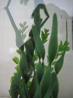
This is a Bad Composition.
For starters, the picture is to blurry and it's centered.
It has a lot of the good composition characteristics, however the jail characteristic the instructor mentioned, so it is not a good image.
To correct this we might need to find a focal point and make it clear. For example, if we make the pot clear and the background blurry at least the images will pop up.

This is a Good Composition
It has the six elements of art, as well as six of the seven compositions. All this picture lacks to be define as perfect is domination. However, it has texture, color, repetition, movement, unity and most importantly- balance!
This is a Good Composition
This image has a lots of textures and same colors but in a different place, which is like the image with the two lady's standing and the other one sitting in the lecturer. The repetition of the color makes your eye go around the picture instead of focusing on one spot. Because the picture is taken from a side, it has good movements.
This image has a Bad Composition, the reason is because it is centered and there is a lot going on. It is hard to identify or connect to the image because it is not clear.
Subscribe to:
Comments (Atom)


